Specified materials
- SABS / LÏEF Block exterior — pigmented lime-plaster finish (Laterite Red, Kaolin White). Avoid bare SABSCRETE grey — it reads imported.
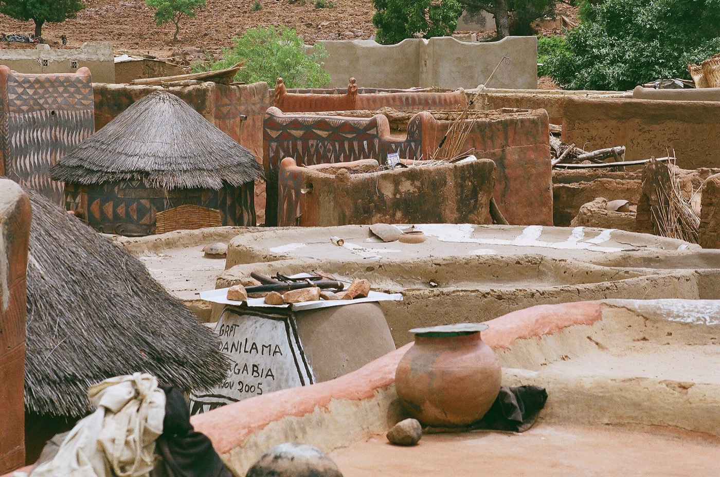
- Laterite-clad plinth at every ground-floor wall — locally cut blocks, ~600mm high. Roots the building in the ground visually and protects from monsoon splash.
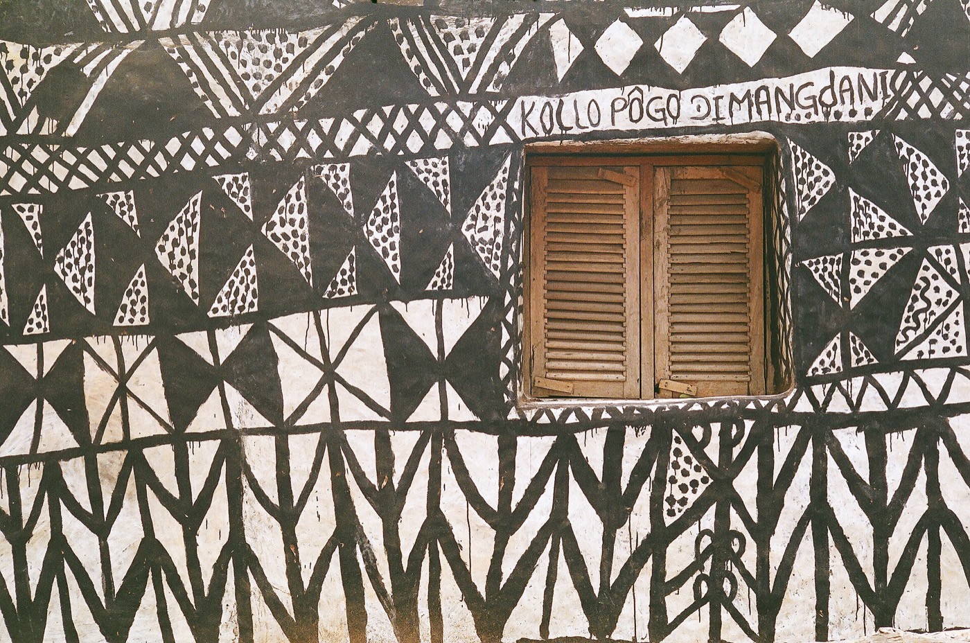
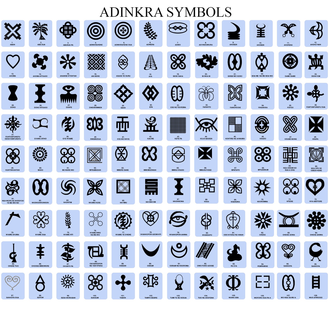
- Breeze-block / claustra screens — locally fabricated cement screens on west elevations. Adinkra-symbol-derived patterns where civic.
- Corrugated zinc roofing — painted Kaolin White or natural — with deep parasol overhangs for shade + rain.
- Hardwood joinery — local sustainably-sourced where possible (Ofram, Wawa).
- Polished concrete floors with red-iron-oxide pigment for civic buildings.
- Solar PV on every roof + dedicated solar field.
- Kente-derived textile graphics as wayfinding banners + interior textile feature walls.
Type families that read modern-African
- Display: Studio Type / Vocal Type / Bandhu — African-designer foundries
- Body: Inter or Source Sans (free, supports Ewe diacritics: ɖ ɛ ƒ ɣ ŋ ɔ ʋ)
- Editorial accent: Tiempos or Source Serif
- Avoid any "tribal" display fonts — they read as kitsch
Possible local partner
Hive Earth Studio (Joelle Eyeson), Accra-based rammed-earth specialists. Worth a real partnership conversation as our earth-finish + plaster consultant on site. @hiveearthstudio
Material precedents
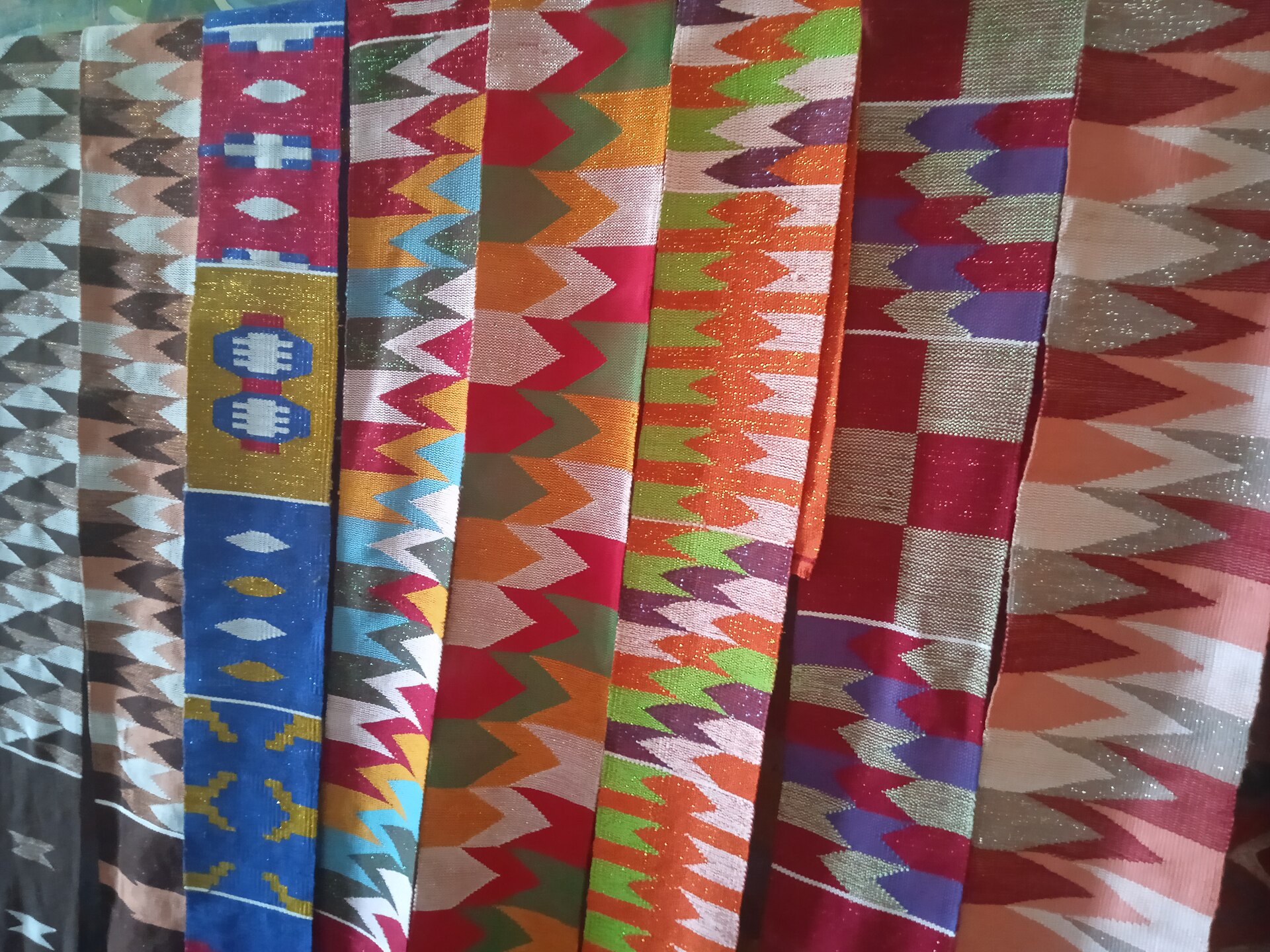
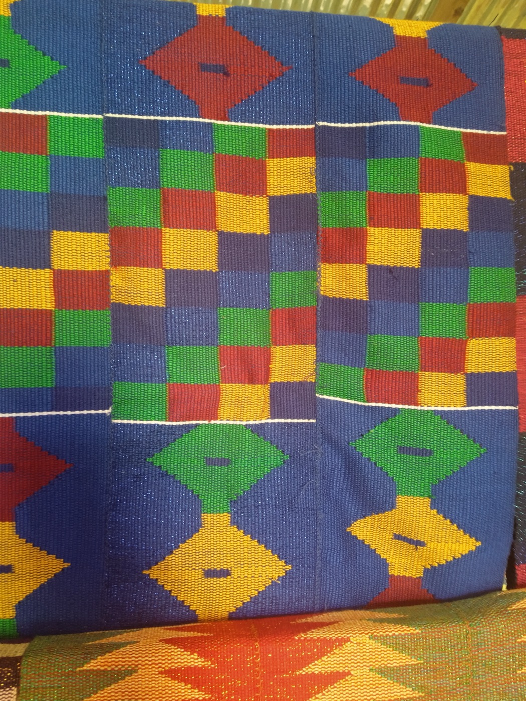
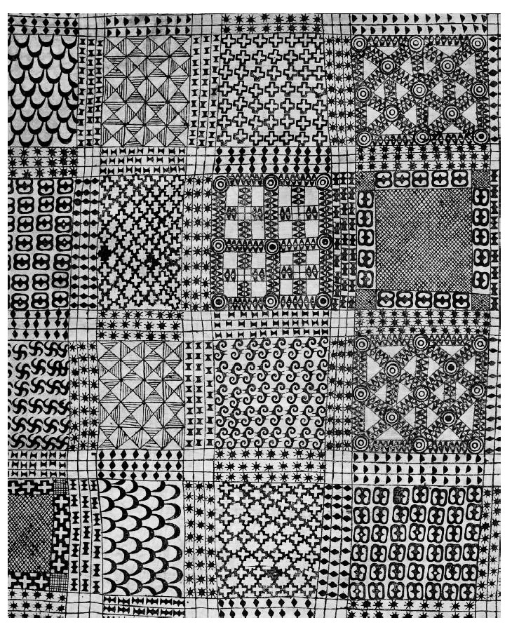
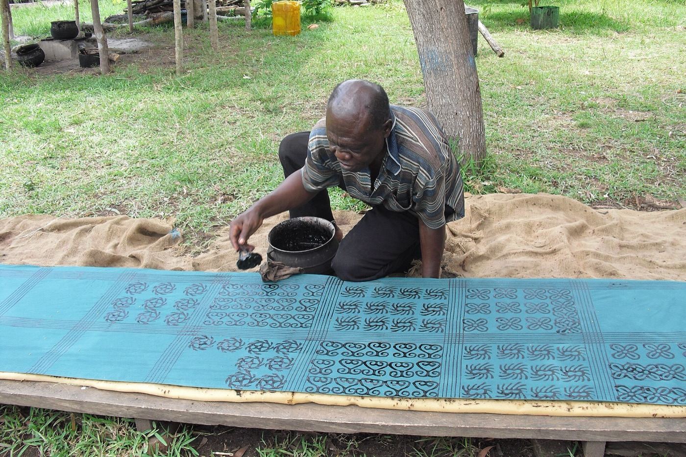
Textile language · Kente, Adinkra, Indigo
The graphic language of the city. Every wayfinding sign, every civic building doorway, every brand mark should have one of these as its grandparent.
Brand-narrative wedge
The four images above are the entire brand identity in seed form. Kente as palette, Adinkra as graphic syntax, indigo as accent, laterite as material. Done well, that gives the city a logo-mark, a sign system, a textile program, and a cultural narrative all from one source. Adjaye does this for civic projects. Kéré does this for community projects. There is no reason a 1,000-acre Ghana city should not.